Your own colors
If none of the palettes fits your branding, change single colors. It is best to choose the palette that comes closest first and then adjust one or two colors.
Changing colors
- Open Appearance → Editor → Styles → Colors.
- Choose Edit palette.
- Under Theme, click a color and pick the new value in the color picker or enter it as a hex value.
- Click Save at the top.
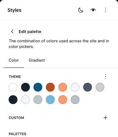
The colors of the palette
| Color | What Ahoi uses it for |
|---|---|
| Base | page background |
| Contrast | text |
| Primary | links, buttons |
| Accent | small lines above headings, short lines, labels, the call to action band |
| Accent, bright | accent on the dark band in the footer |
| Surface | tinted sections, image spaces in the patterns |
| Muted | secondary text such as dates and subtitles |
| Line | dividing lines |
| Dark band | footer background |
| On dark band | text in the footer |
| Muted on dark band | secondary text in the footer |
| Primary (dark), Accent (dark), Muted (dark) | the dark values of Primary, Accent and Muted, see below |
What happens in dark mode
The colors of the palettes each have a light and a dark value. When you pick a color yourself, WordPress stores only one value. Ahoi handles it like this:
- Primary, Accent, Muted: Your color is used in light mode. For dark mode, Ahoi derives a lighter shade from it that is easy to read on the dark background.
- All other colors (Base, Contrast, Surface, Line, the band): Your color is used in light mode; dark mode keeps the value of the palette.
Choosing the dark shade yourself
If you do not like the derived shade, change the matching field Primary (dark), Accent (dark) or Muted (dark). Your value is then used in dark mode exactly as you chose it. Ahoi does not adjust it, even if the contrast is too low.
Back to the derived shade
Under Edit palette, open the Color options menu next to Theme and choose Reset colors. This resets the whole palette, including your light colors. Then pick your light colors again; Ahoi derives the dark ones by itself.
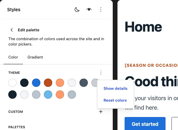
A "(dark)" field that is set exactly to the value of the palette counts as unchanged, and Ahoi derives the shade.
Checking the contrast
Ahoi uses your light colors unchanged, even if text becomes hard to read. So check each color you pick:
- Text and links need at least 4.5 : 1 against the background, large headings 3 : 1.
- Field borders and controls need 3 : 1.
Any contrast checker will do, for example the one in the browser's developer tools. Check light and dark: for the dark side, turn on the dark preview under Styles in the Site Editor (button with the moon icon), or use the toggle in the header on the front end.
Good to know
- The color picker shows
#000000. When you open a color of the palette, the WordPress color picker first shows black instead of the color. This is due to the editor: it cannot read color values with a light and a dark value. The color itself is correct, as the swatch in the list shows. - Your own colors on single blocks do not switch between light and dark, see Light and dark.
- The "(dark)" fields in the color settings of blocks. When you choose a text or background color for a block, "Primary (dark)", "Accent (dark)" and "Muted (dark)" are listed there too. They are meant for dark mode and are too pale on a light background. For blocks, use the colors without "(dark)"; they switch by themselves.